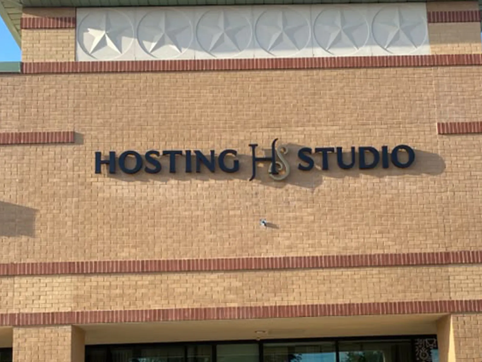
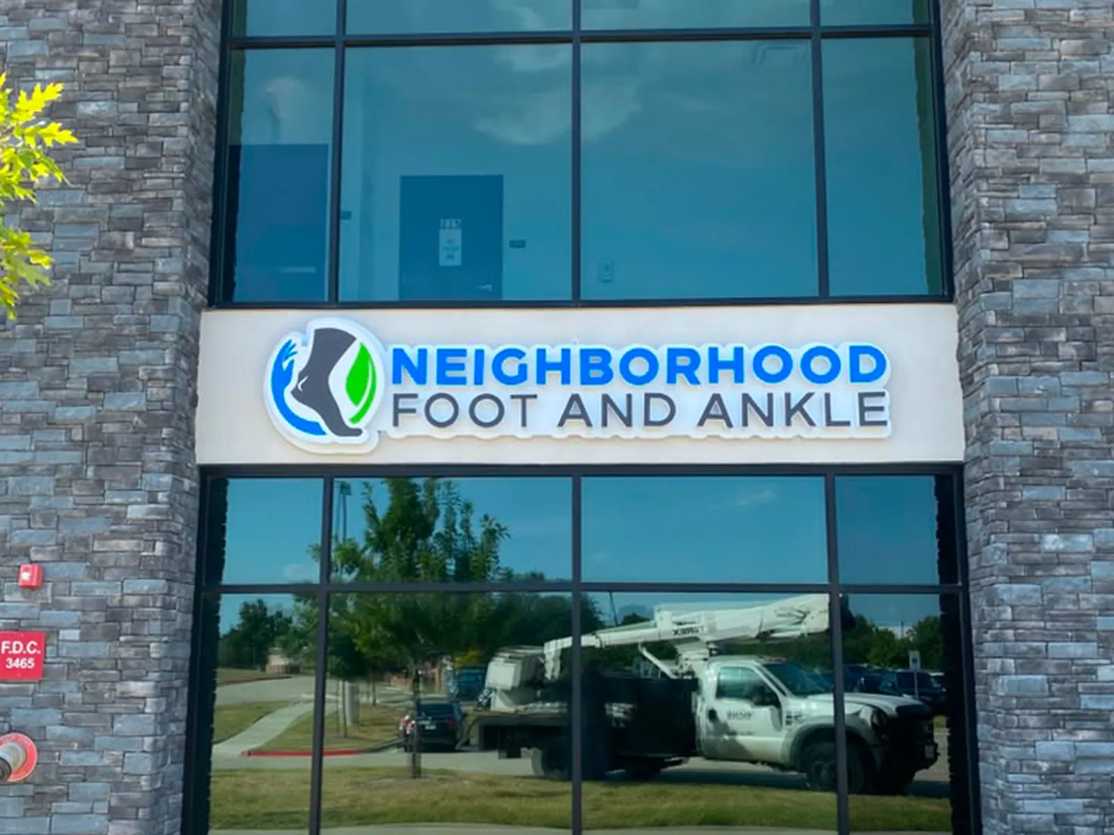
An industrial wall is large, flat and usually one light color, so building letters have plenty of room and little competition. The risk is going too small. Letters that look generous on a drawing can shrink to nothing across a truck court, so we size them from the distance people actually see the building, whether that is a frontage road, a highway or the entrance to the park.
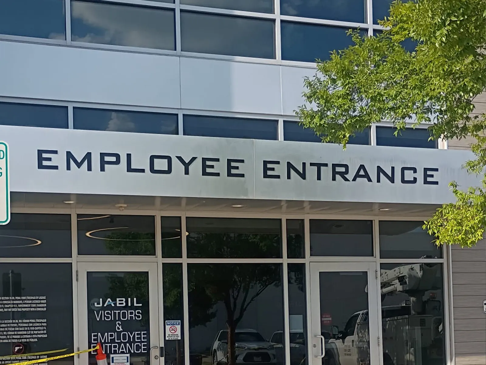
Placement does as much work as size. Putting the name above the office entrance, rather than over a row of dock doors, tells visitors which door is theirs before they park.
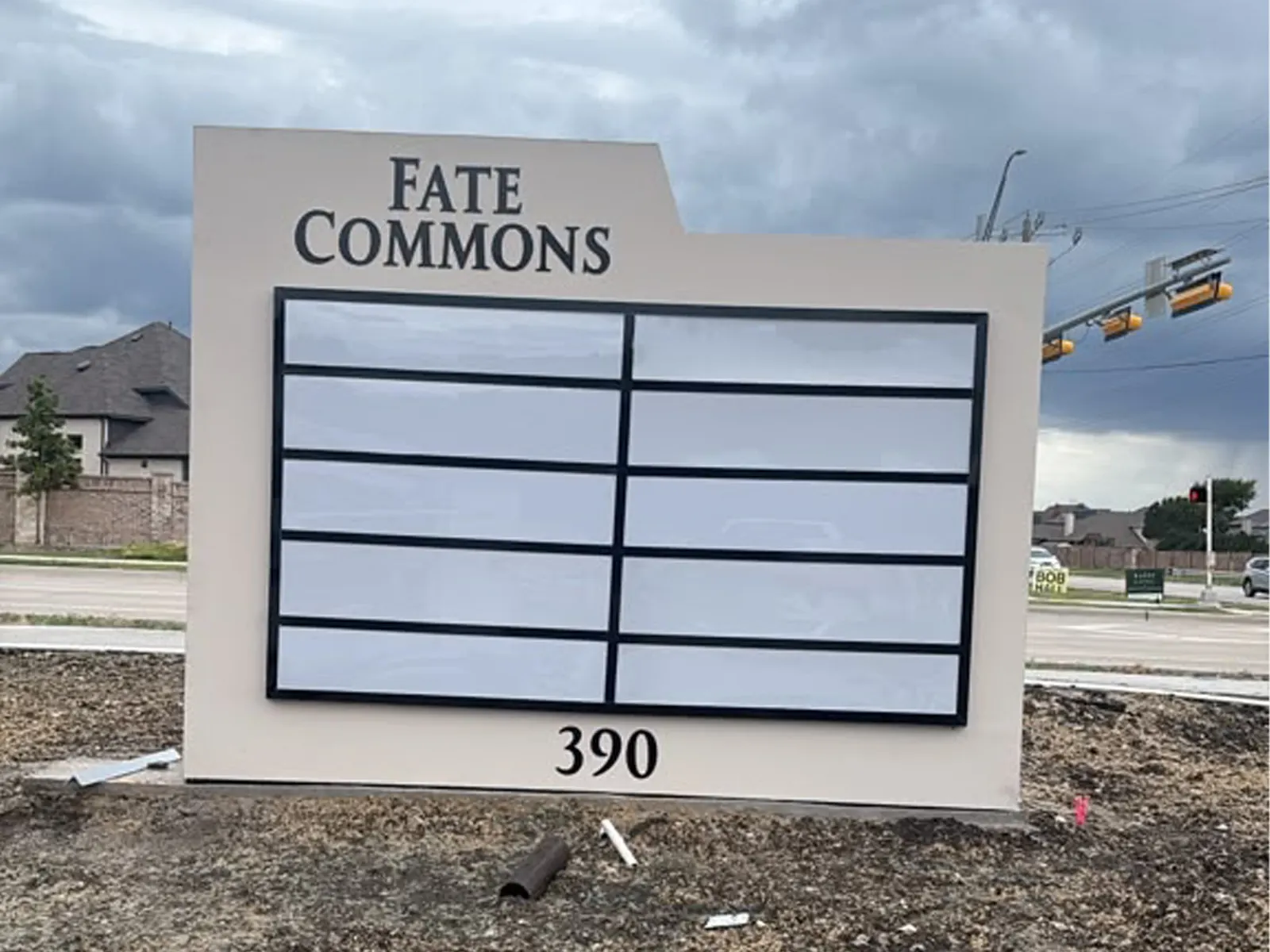
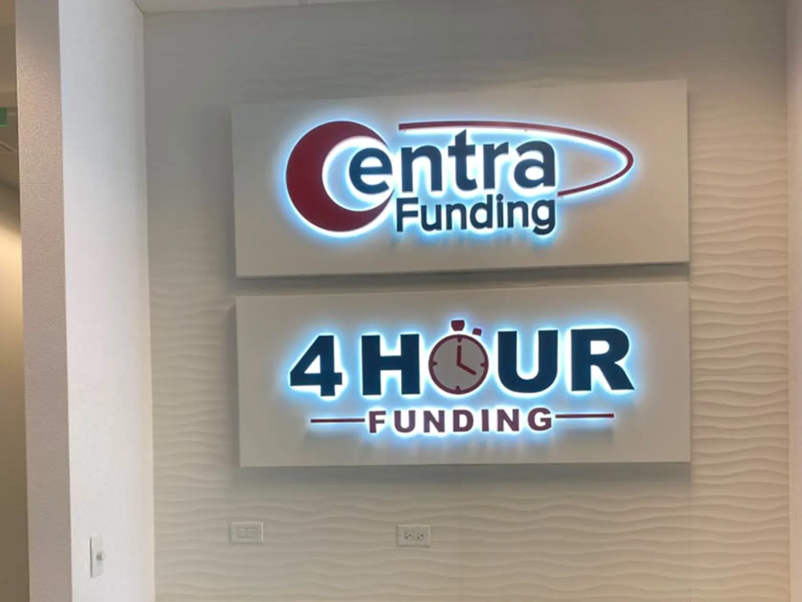
Contrast carries the sign in daylight. Many industrial sites also run early and late shifts, when lit letters or a lit monument help drivers and staff find the entrance in the dark. On concrete tilt-wall panels, the attachment is detailed for the wall and power is routed to the sign location before installation day.